Avoiding the sugar rush: The ins and outs of developing a sports logo
(Warning: Story contains coarse language)
Todd Radom often feels like an architect, even though the longtime graphic designer doesn't dream up buildings.
A specialist in sports logos, Radom believes creating a brand identity for a professional sports franchise is similar to designing the structure of a house. And the foundation for a strong identity is laid during the logo rollout.
"You want to build a foundation that is solid and enduring, and know that when you put your house up, you can put a coat of paint on it," Radom told theScore. "If you want to paint your house pink, go ahead and paint it pink. You want to put shutters on it, go ahead and put shutters on it. You want a flat roof? You want a peak roof? You can do some things, but without that foundation, it's going to collapse."
Enter Seattle. Recently awarded the NHL's 32nd franchise for the 2021-22 season, the ownership group needs to lay a foundation in multiple senses - literally when it comes to constructing a new arena (slated to open in early 2019), and metaphorically in building an identity (no timeline for an unveiling).
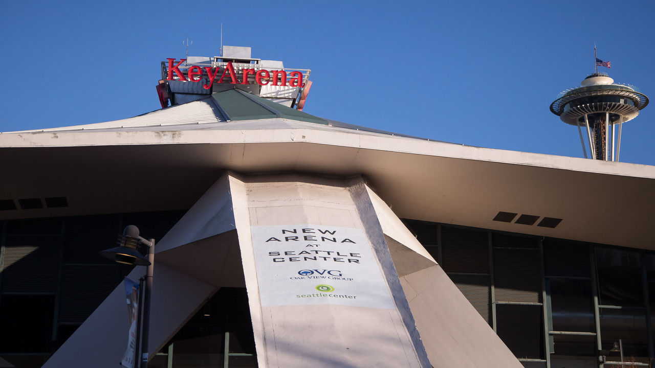
Both projects involve enormous thought and investment, but the matter of identity - landing on an appropriate team nickname, color scheme, logo, and uniform set - sparks the imagination on a higher level.
Kraken? Sea Lions? Metropolitans? Totems? Sockeyes? Seattle's in a unique situation where ownership isn't necessarily being forced into one particular style.
"If you are an expansion team with a clean slate, a blank canvas, you really have liberties to go places you might not otherwise," Radom said.
So what exactly goes into the creation of a pro sports logo?
We enlisted the help of three experts - Radom, Chris Creamer of the popular website SportsLogos.net, and Bill Frederick, creative director of sports branding agency Fanbrandz - to find out.
The stakeholders
Generally speaking, five main groups are involved in the logo development process, according to our panel of experts.
First and foremost, there's the team itself, as well as the league office. The jersey manufacturer and logo designer are key influencers, too. The final group is the fan base, which may be consulted via polls, focus groups, and other outreach methods.
In Seattle's case, the league's official jersey partner - Adidas Hockey - will have a major voice. The currently unannounced designer will also exert its influence during the creative stages of the multimillion-dollar process.
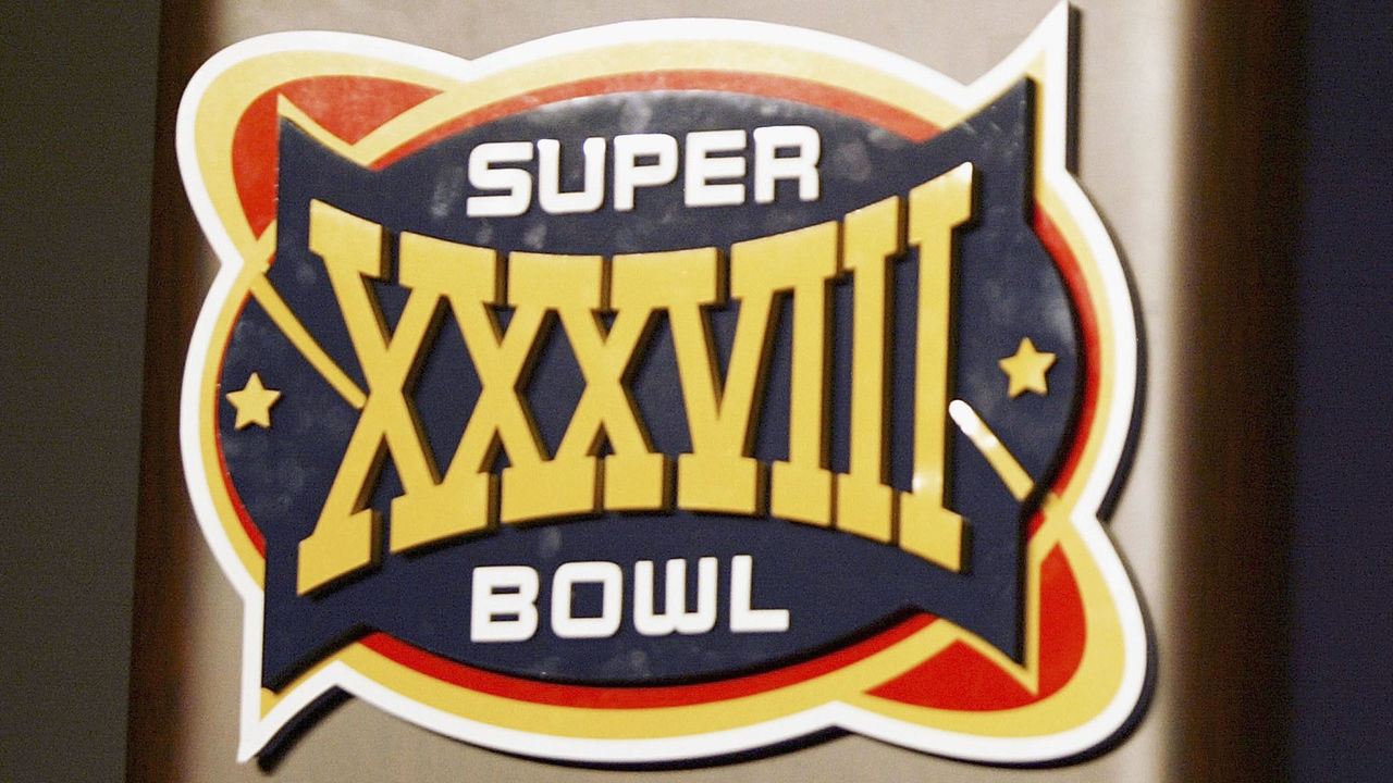
"If a team is a passenger on a plane, I need to be a seasoned pilot who is flying them across the ocean to their destination," said Radom, describing his role over the years in helping teams and leagues create identities, such as the logo for Super Bowl XXXVIII. "I need to let them out safely and they can go about their business."
There is no hard and fast time frame for finalizing a logo, Radom says, though 18 months is a typical ballpark figure now. The team will want plenty of runway to exchange mock-ups with the designer, engage with lawyers, and consult with licensees and broadcasters. At the major-league level, no stone is left unturned.
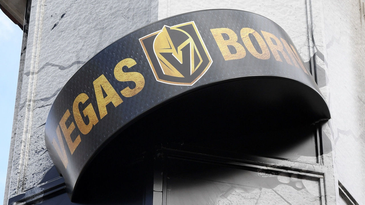
The smart play, Creamer notes, is securing all necessary legal rights immediately after agreeing on a team name, but before diving into the logo design process. Without a definitively trademarked brand, a team might run into issues like those experienced by Las Vegas' NHL team, which recently fought with the U.S. Army and College of Saint Rose over the use of "Golden Knights."
"I imagine the Seattle ownership group, Adidas, and the NHL are going to be so much more careful this time," Creamer said. "Maybe (they should) just trademark whatever they want right out of the gate. Make sure there's no problems."
When asked for a progress report, a spokesperson for Seattle's incoming NHL franchise issued a short statement saying the ownership group "continues to listen to fans and explore the team brand identity. Fan engagement has been, and will continue to be, a critical part of that work."
Sports teams don't exist without a healthy fan base. Public input through both official and unofficial channels informs the decision-makers. Fans feel a personal connection to every scoring play, front-office transaction, and mark of the team's identity. And they're the ones forking over the cash.
People care about their favorite team's logo to a degree that's unimaginable for design in other industries. There's a reason why Radom and Creamer are working on a book telling the stories behind the names and looks of every NHL franchise.
"Let's say TD Bank changed its logo tomorrow. Odds are, there aren't people with that TD Bank logo tattooed on their ass," Radom said with a laugh.
The do's and don'ts
In the world of sports logo design, simplicity is king.
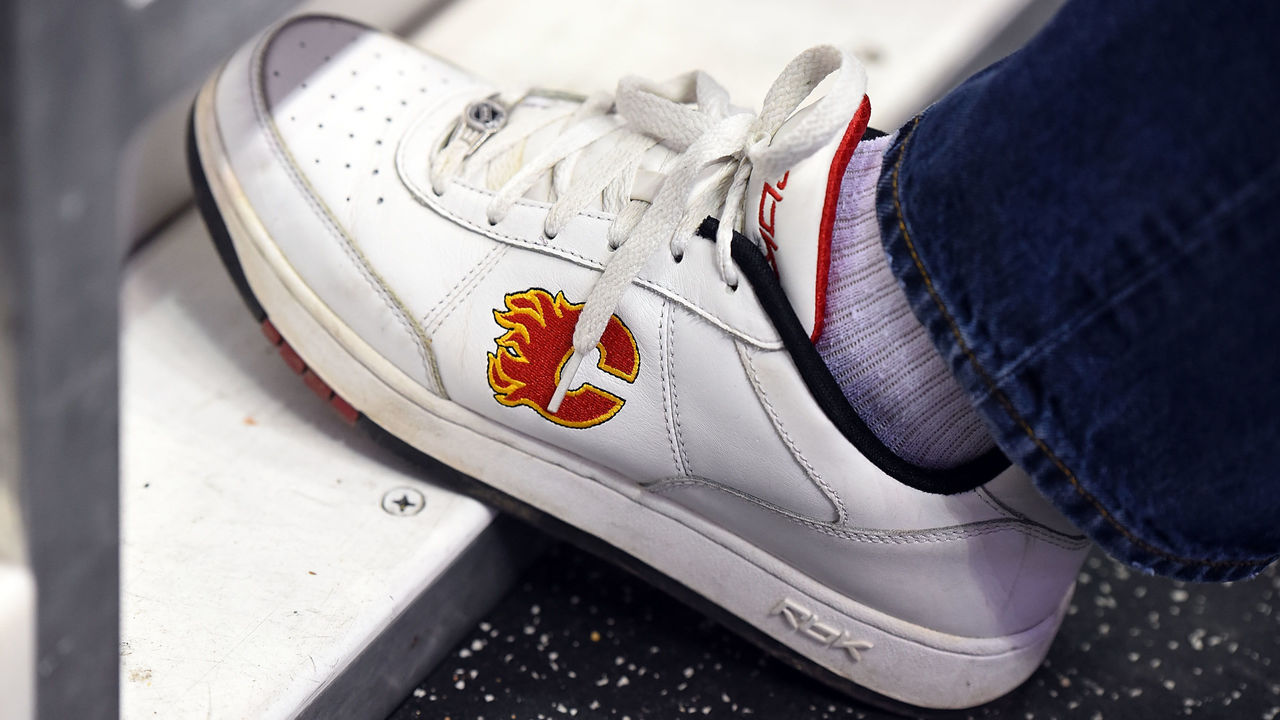
"You want a logo that is simple enough that a child can draw it easily, but also not something that's so simple that it doesn't represent anything," Creamer said, referencing his 5-year-old son's penchant for doodling the to-the-point logos of the Calgary Flames and Philadelphia Flyers.
Teams should want a logo that you can spot from a distance, Creamer adds; a mark versatile enough to appear on a TV channel's ticker and not look out of place as a social media avatar. And teams can't forget about belt buckles, pocket schedules, billboards, ball caps - every surface and product a logo could be slapped on should be considered in the research and development stage.
Creamer's ideal icon straddles the line between kid-friendly and edgy in order to maximize reach. "You always have to have an eye on what's going to sell," he said. "Kids don't buy merchandise, parents do." (For what it's worth, the current Toronto Blue Jays crest is the highest-rated logo on Creamer's site.)
Frederick has worked on everything from the rebranding of MLB's Tampa Bay Rays to the NHL's 2019 Winter Classic and prefers a certain amount of stature in big-league logos. He mentioned growling animals as an example of an angle that might flourish in the college market but doesn't suit a world-renowned circuit like the English Premier League.
"It's like designing a country's flag. You're building this platform for shared values and you're establishing trust and loyalty," said Frederick, listing Liverpool FC's logo among his personal favorites. "Usually it's based on a lot of research and you're really trying to find the soul of the city."
Radom, meanwhile, encourages teams to "think iconic" and to stay far away from the wacky, complicated stylings of the 1990s. Remember the Wild Wing mascot bursting out of the Mighty Ducks alternate jersey? No surprise that didn't last long.
"Think about that tribal connection with color and think about the fact that a lot of people are going to have their fingers in it," he said. "Impressions are very fleeting - now more than ever, right? We're all very challenged with our screens. ... I think with sports, especially given the cost involved with a rollout, you want to think about the future."
The DNA factor
Also in vogue: Throwbacks.
NHL Seattle might want to pursue a modern look, but the explosion of alternate jerseys and a general thirst for simplicity has created a gigantic secondary market for legacy organizations. Vintage merch sells, both because it looks sharp and because it makes people feel warm and fuzzy about their community.
Exhibit A: The Golden State Warriors' main crest - one of the world's most recognizable sports logos - is a blast from the past for the Bay Area.
"Nostalgia is a powerful emotion," Radom said.
Aligning a brand identity with the market's DNA is a must. It can really make a logo sing and, unlike the vintage angle, can be leveraged by expansion franchises. The Golden Knights, for instance, tastefully tapped into their city's cultural identity.
"The DNA in Vegas, as a community, is far different than any other market, right?" Radom said. "What that franchise did in terms of little, subtle glint in the gold color on their sweaters, and a little pattern which almost looks like gaming chips - that was exceptionally intentioned and very well executed. There's something to be said for blinking your eyes and feeling a sense of place and community."
The new NHL team in Seattle - a city known for the Space Needle and monorail, thriving tech and music scenes, and a little coffee chain called Starbucks - has an opportunity to draw upon its prospective fan base's deep-rooted values and interests as well. Even the relatively benign choice of a green color scheme would likely please the masses in Seahawks, Mariners, and Sounders territory.
Above all else, teams need to have one eye on the short term and the other on the long term. NHL Seattle must ask itself, "What does the world look like in 2021 and in 2031?"
"You don't want to go for a sugar rush," Radom said. "You want to build something with the future in mind. Something people will be proud of and use for years to come."
John Matisz is theScore's National Hockey Writer. You can find him on Twitter @matiszjohn.
HEADLINES
- MLB Power Rankings: Padres claim top spot, Braves behind eight ball
- Padres' Arraez avoids major injury on scary collision
- Acuña reacts to Kelenic's lack of hustle: 'They would take me out of the game'
- Sigh of relief: Blue Jays are exceeding expectations
- Hyde frustrated after Orioles allow 24 runs to Reds: 'Embarrassing'