Ranking the 2023 set of MLB City Connect jerseys
Major League Baseball's newest set of six City Connect jerseys has officially been launched, with the Pittsburgh Pirates being the final team of the 2023 editions.
We re-ranked the first 14 City Connect uniforms last year, but this time we'll only measure this season's crop against each other. Here's how they shake out, ranked in reverse order from worst to best:
6. Baltimore Orioles
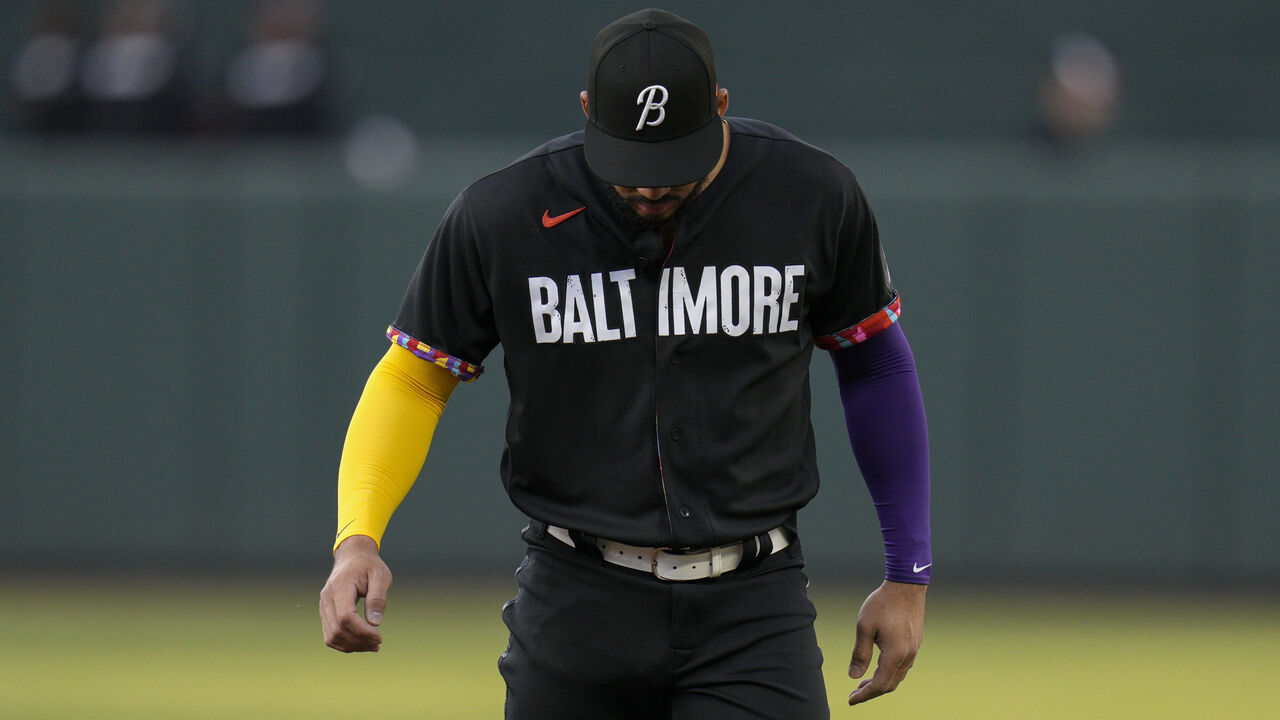
At best, these uniforms feel rushed. But the reality is that they're lazy. The most intriguing part of these jerseys is a colorful design that supposedly pays tribute to Baltimore's neighborhoods, except that it's on the inside of the jersey. Why hide that sort of design? The City Connect program is supposed to be fun, vibrant, and bold. Instead, the Orioles gave us another very boring and bland black uniform to add to their black-and-orange set, with a new "B" logo. Even if we were including the other 14 designs here, the Orioles would be dead last.
5. Cincinnati Reds
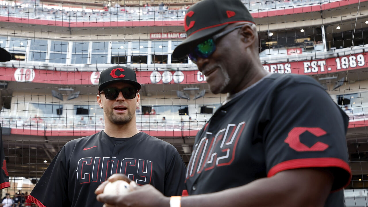
The Reds' attempt certainly isn't bad. The hat, with the red line along the brim that matches the throwback aesthetic of the 100-year-old "C" logo, is actually really cool. But teams need to immediately stop making uniforms where the jersey and the numbers are the same color. That being said, the red and white accents that make the numbers look 3D do enhance it slightly. But they're just not great.
4. Texas Rangers
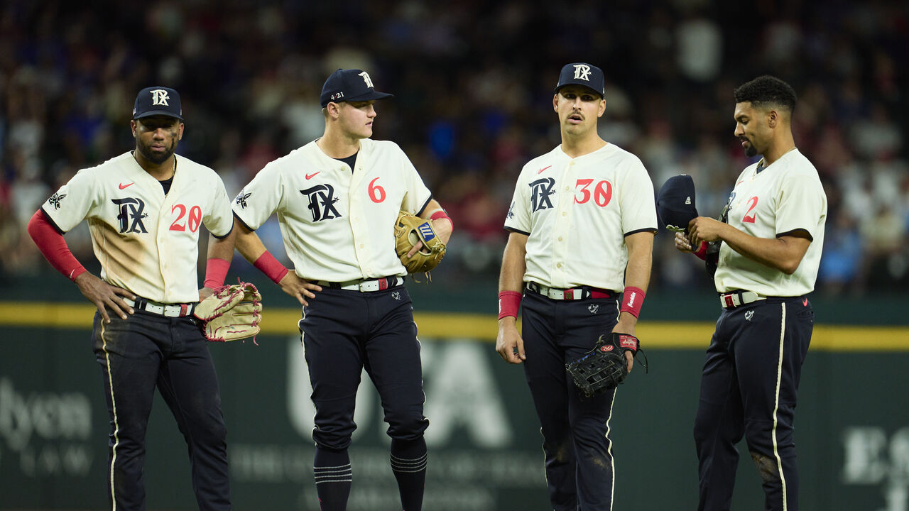
You have to dig deep to appreciate these jerseys, which take inspiration from the many Dallas-Fort Worth minor-league teams that preceded the Rangers. The old English "TX" was taken directly from the Dallas Eagles, the pants design features a logo used by the Dallas-Fort Worth Spurs, and the "Peagle" mascot is a combination of the Eagles and Fort Worth Panthers. We certainly appreciate the thought that went into the creation of these uniforms and the connections to local history. But overall, something feels off about the look. The white jersey and black pants clash, and not in a good way. White pants might help, but even then, from an aesthetic standpoint, they still feel a bit incomplete.
3. Atlanta Braves
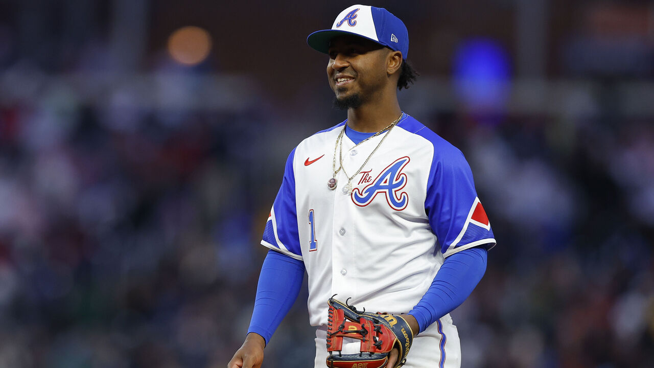
If we ranked these uniforms purely on appearance, the Braves would have a very legitimate claim to be No. 1. But the City Connect uniforms that topped our previous lists are also original. The great ones go out of their way to go at least a little bit outside the box in a nod to the area they call home. This one is a mostly lazy rehash of an already iconic 1974 Braves uniform that they've worn updated versions of in recent memory. So, for that reason, points off.
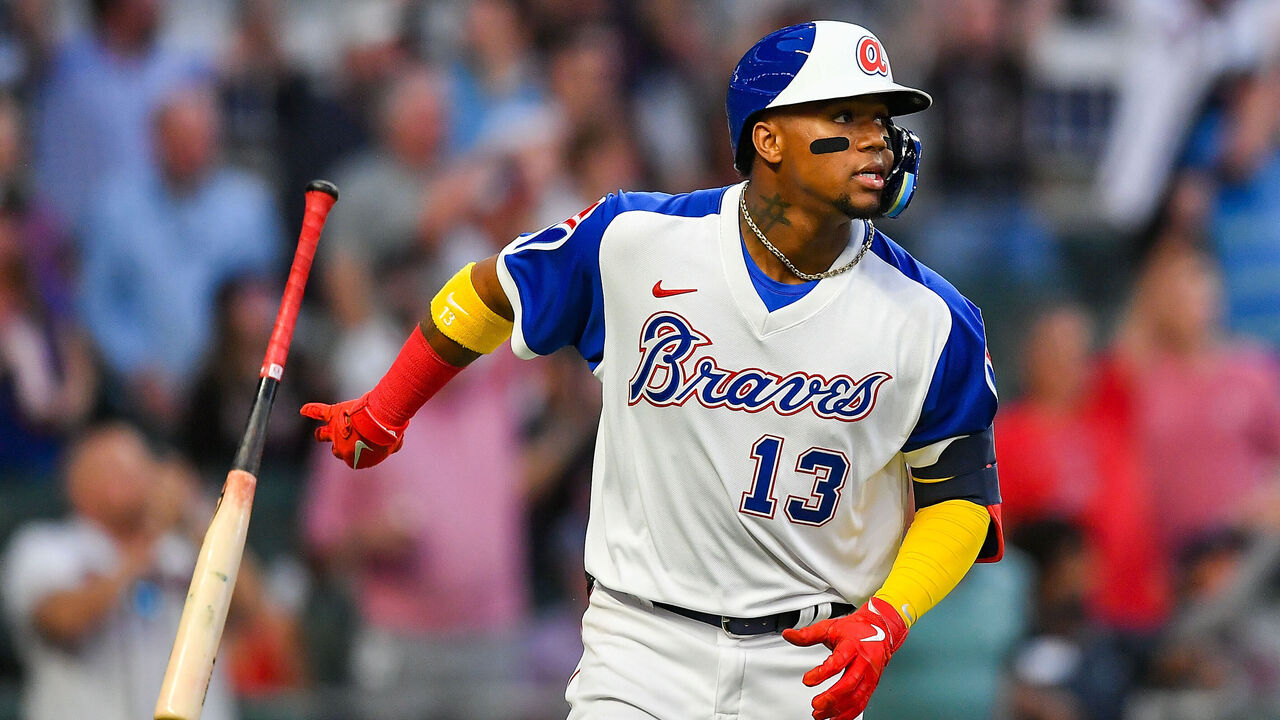
2. Seattle Mariners
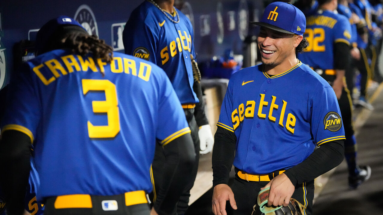
Taking inspiration from the ill-fated Pilots, who moved to Milwaukee after one season in Seattle, the Mariners designed a gorgeous alternate jersey and cap. The royal blue and gold combination always looks good, and the lowercase Pilots font is classic. Bonus points for the slick "PNW" (Pacific Northwest) patch and the always-welcome Mariners trident logo from the 1980s. What's keeping these beauties out of the top spot, however, is the black pants. While the historical nod to the Negro League's Seattle Steelheads is appreciated, it's one color too many. Switch them to blue or even white, and this jumps several spots in the overall City Connect rankings.
1. Pittsburgh Pirates
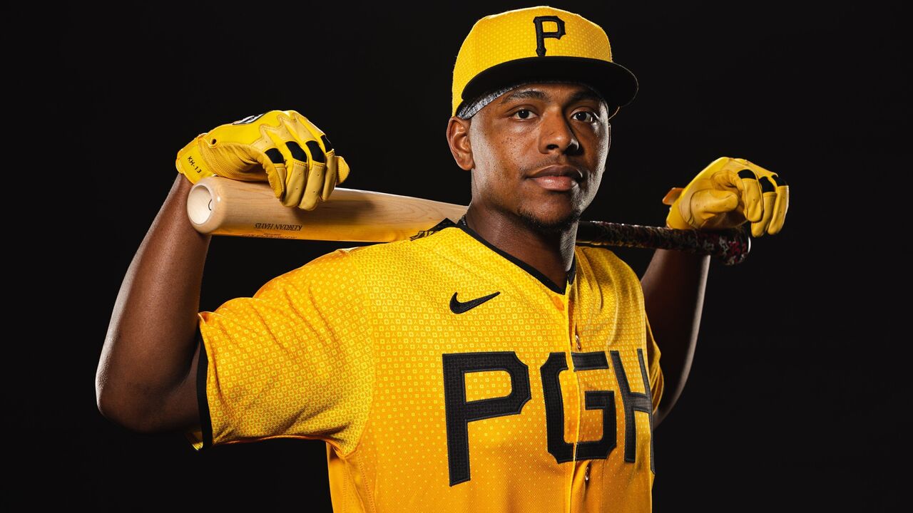
MLB clearly saved the best for last. It might come off as a bit unoriginal, but Pittsburgh is black and yellow through and through, and the Pirates leaned into it by making a uniform of only those colors. The hat maybe could've used slightly more character. And, without making it too noticeable, the addition of the "Steelmark" diamond shape and the three rivers "Y" shape patterned all over the jersey are a great small detail and nod to what makes 'em yinzers.