Despite the continued onslaught of "polar vortexes", spring training baseball is finally here. Just saying that almost makes me forget about the 7-foot tall snowbank at the end of the driveway... almost.
This year every Major League club has a new spring training uniform (or "BP uniform", as they're officially called). Most teams made changes so minor that they aren't worth even mentioning, these are teams which made a change such as a slight shortening of underarm colors to the addition of a single stripe at the sleeve or around the collar. We're not going to bother you with those here, instead we're going to focus on the more interesting changes to BP uniforms around the league this spring.
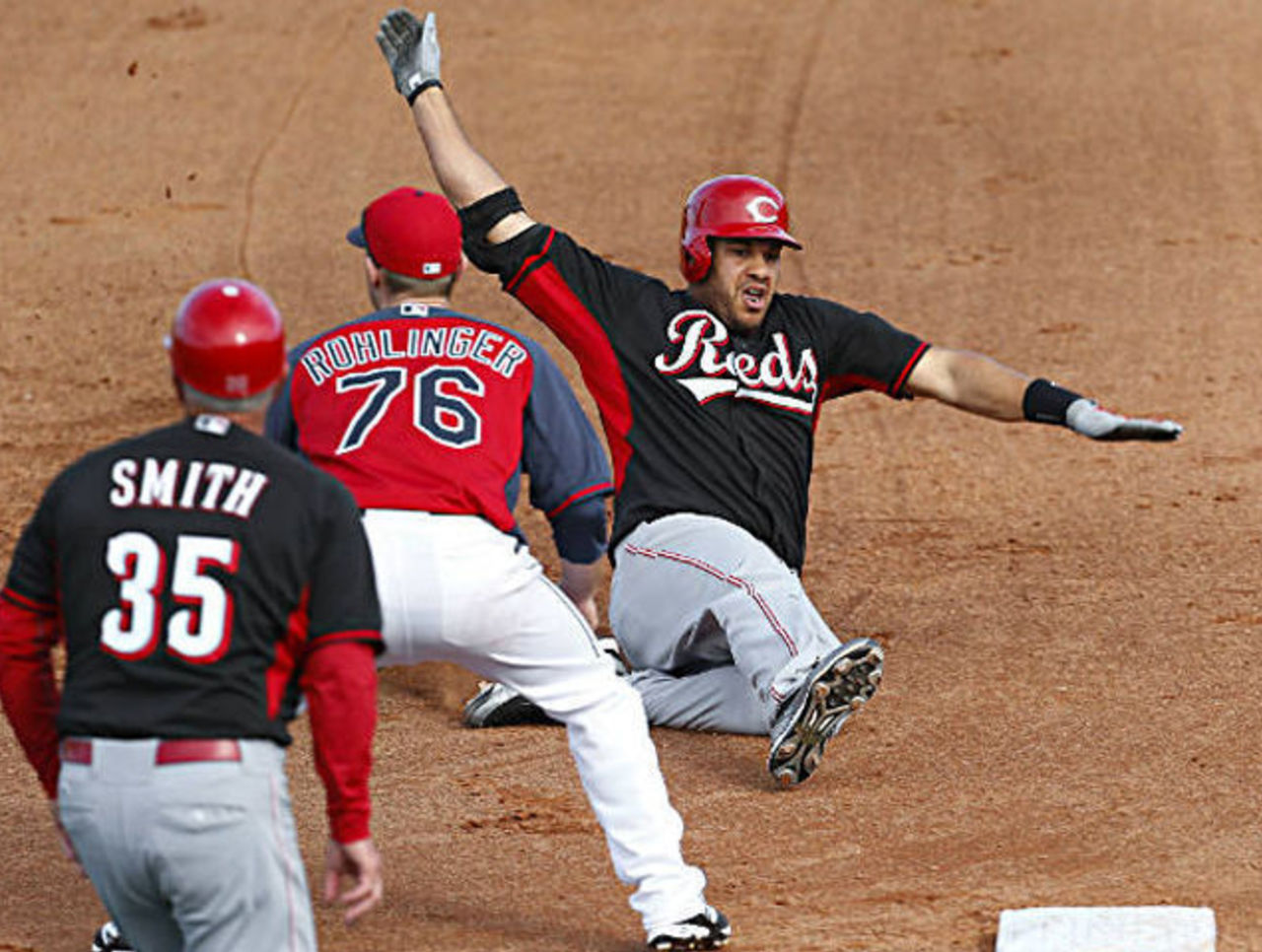
There was local outrage at the Cincinnati Reds taking to the field wearing all-black uniforms for their first spring training game of the year last week. This despite the uniform being leaked way back in October, and then officially unveiled at the Reds own "Fan Fest" in December. Did none of the Reds fans at "Reds Fan Fest" completely forget about this?
It is hard to see the Cincinnati REDS wearing nothing but BLACK, but wearing black is nothing new for the Reds -- in addition to it being the main secondary color of the team for over 15 years now, they also wore an all-black B.P. uniform on the road for four long years from 2003-06. This new all-black Reds spring uniform is reserved for road games and is expected to be worn on the road throughout the 2014 season during pre-game batting practice sessions only. Despite this, after all the hoopla over the black, I'd be surprised if we see this uniform much more during the year.
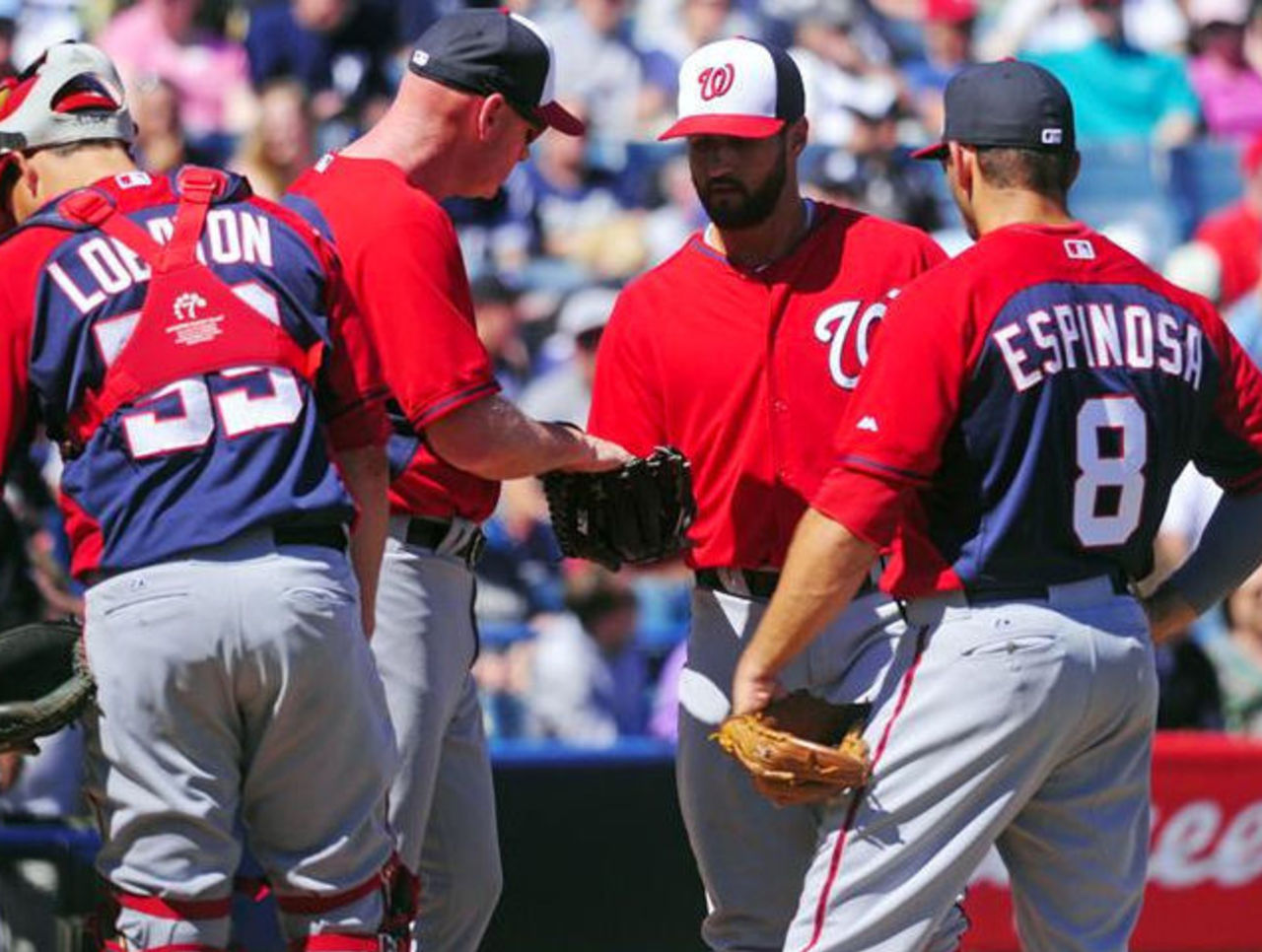
Notice something a little off about the Washington Nationals uniforms in the pic above? In case you don't, some of the players in that mound meeting are wearing blue jerseys, while others are wearing red. They all play for the same team despite these different colors, what you're seeing is the début of split-colored baseball jerseys in the Major Leagues. The front of the uniform is one colour, in this example red; while the back is another, blue here.
Six teams are wearing the split-colored jerseys this spring and into BP sessions in the regular season. The Atlanta Braves (blue front/red back), Cleveland Indians (blue/red), Colorado Rockies (black/purple), Kansas City Royals (blue/powder blue), Tampa Bay Rays (blue/powder blue), and of course the Washington Nationals (red/blue).
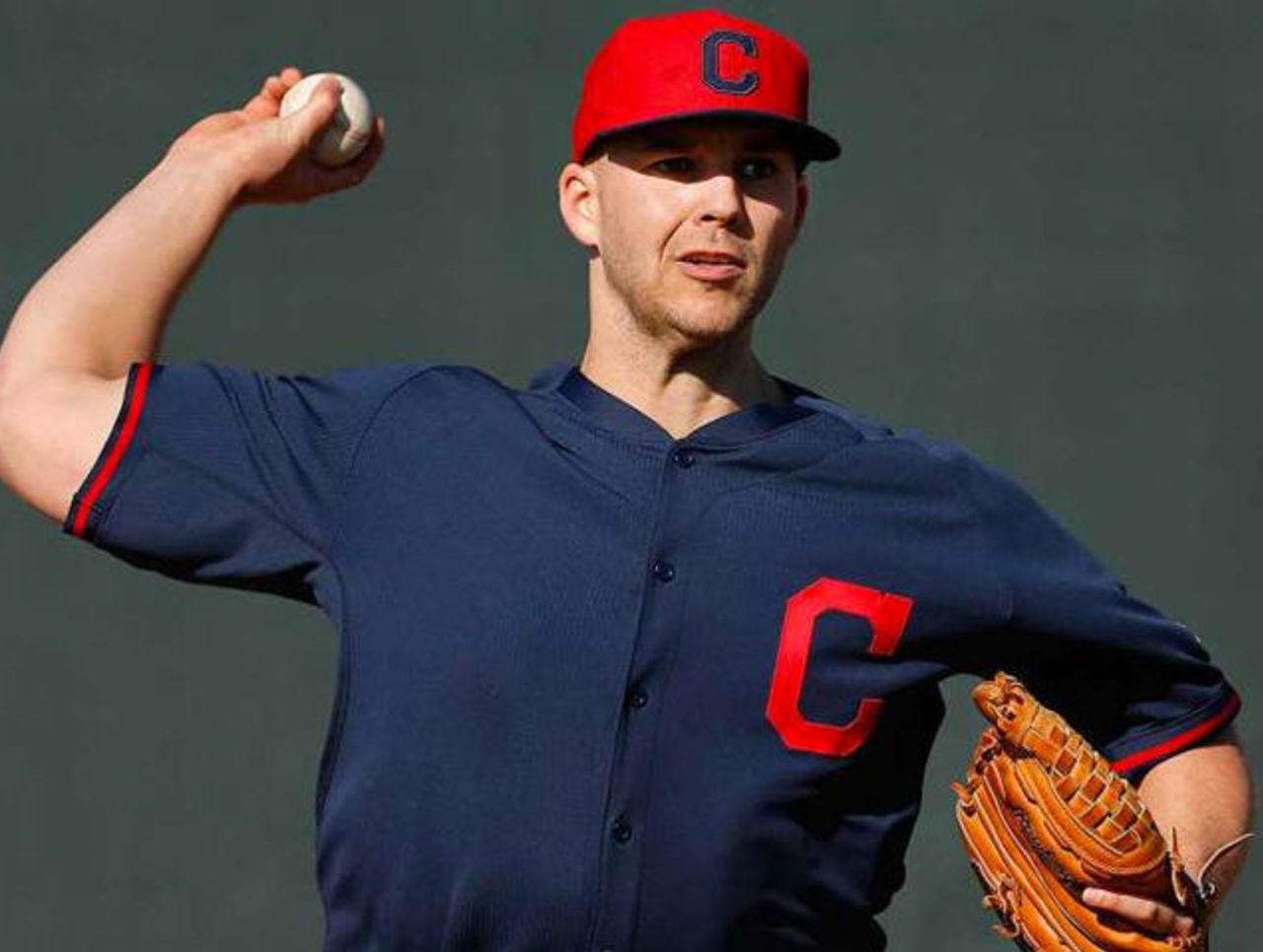
Speaking of the Cleveland Indians, their new spring uniforms have removed all previous traces of the "Chief Wahoo" logo. This despite assurances by the ballclub that their usage of Wahoo would not be diminished heading into 2014. While the block "C" cap has been worn for several seasons now, the uniforms previously had spelled out "INDIANS" across the chest with "Wahoo" right on the sleeve. In it's place is the "C", which is also the new primary logo of the team.
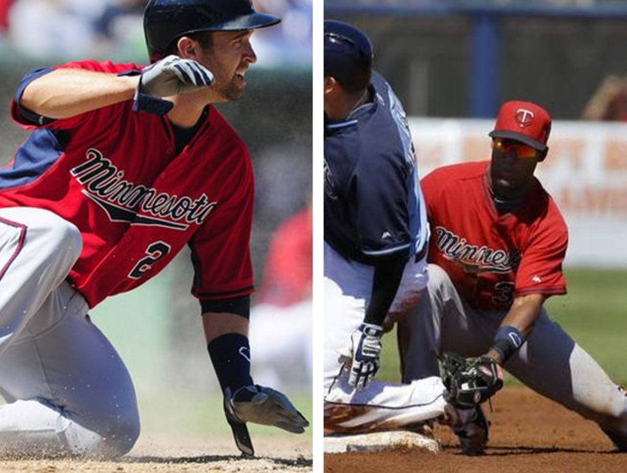
The Minnesota Twins have introduced an all-red road spring training uniform, a red cap with "MINNESOTA" across the front of the jersey. Red has been the secondary color of the Minnesota Twins franchise since their days in Washington long, long ago. They even wore it as their main cap color for several seasons as recent as the 1980s, and again an ill-fated all red alternate jersey which lasted a single season in 1997.
That doesn't change the fact that seeing the Twins clad in all-red jerseys with red caps to match doesn't look a little odd; they've always been a navy blue team to me and I suspect many of their fans feel the same way. This new look will probably last about as long as their previous experiment with red as a primary color back in the '90s.
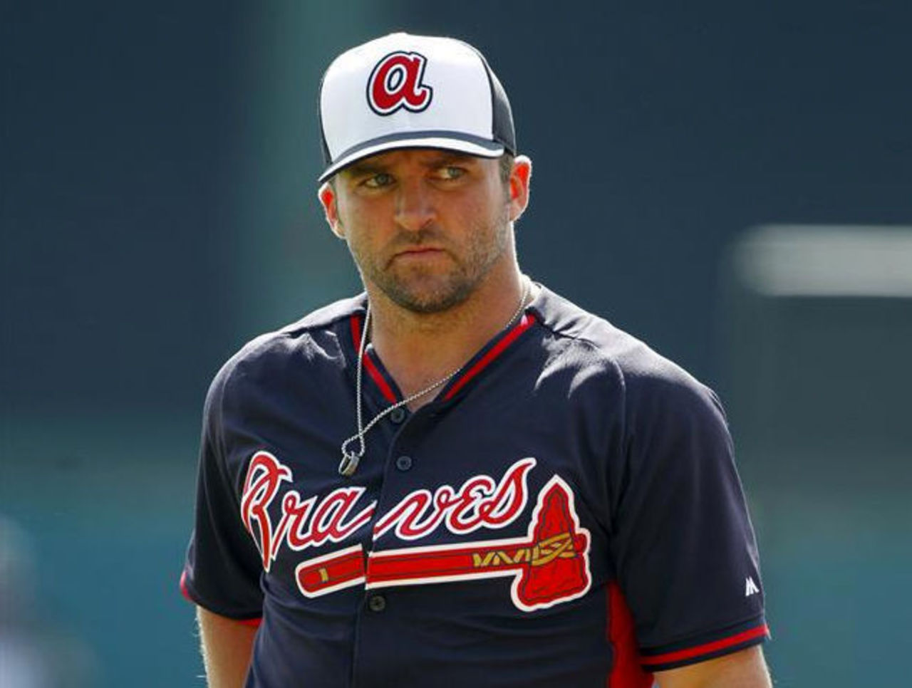
Last season the Braves tried to bring back a controversial logo from their past to wear on their new BP cap... the Internet exploded and the team backed off denying they ever considered such a move (of course caps were already approved by the team and a bunch were made available for sale, you can still find some up on eBay). This year they tried to reach into their storage unit once again but this time picked a much safer logo, the lowercase "A" cap logo from the 1970s, made famous by Hank Aaron hammering his 715th career home run in it.
The cap is exactly the same as that worn from 1972-1980 except the colors have been updated to the modern Braves color scheme in place since 1987. It's an interesting clash of Braves design eras, the modern-traditional of today with the "what's a tradition?" design style of the '70s. Personally, I don't think it works.
Atlanta's also one of the six teams with the split-colored jerseys, so that's a split-colored cap and a split-colored jersey. Now, stay with me here, folks... this means Atlanta is wearing a uniform which has a white cap and blue jersey when viewed from the front but a blue cap with a red jersey from the back. See where this is getting a little silly?
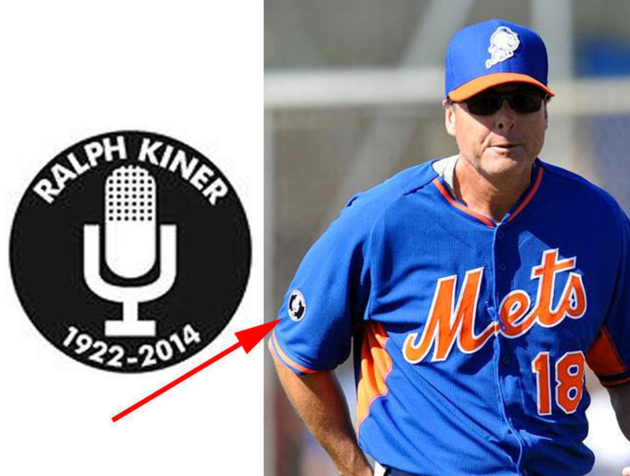
The Mets didn't make a big change to their spring outfit but they did add a patch to their sleeve in memory of their play-by-play man Ralph Kiner, who had been with the club since day one of the Mets in 1962. Kiner died during the off-season and the Mets plan on wearing this patch, featuring a microphone with Ralph's name and birth-death dates, on all of their uniforms from pitchers-and-catchers reporting right through the end of the regular season (because c'mon... Mets? playoffs?!).
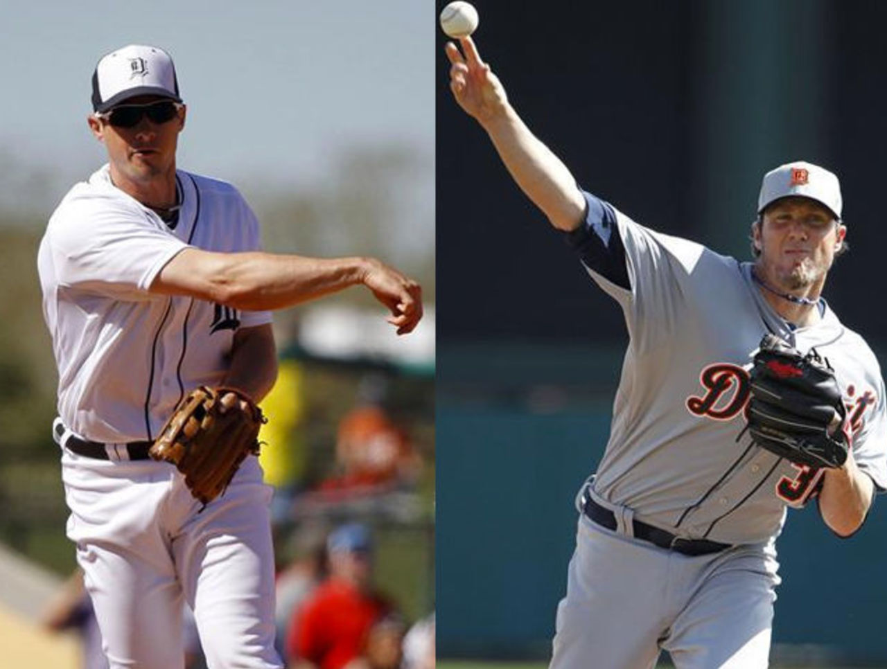
This isn't anything new, but it annoys me to no end. The Detroit Tigers are a team which never wears their spring uniforms during spring training games -- that's cool with me, I love going down to Florida and seeing a big league team wearing their regular season jerseys in such a small venue. It's neat. So why must the Tigers opt to wear their all-grey and half-white/half-blue BP caps with their classic regular season uniforms? It's a shame, really, and it looks bizarre. It happens every year, but thankfully this is only something we see during spring training.
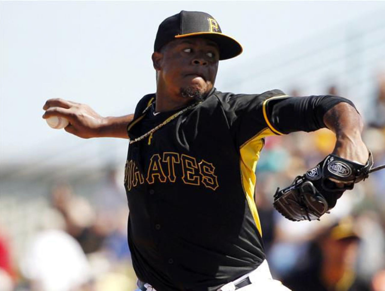
Pittsburgh celebrated the introduction of their new all-yellow primary logo for 2014 by dropping the only all-yellow uniform in their set. The Pirates new batting practice jersey is black with "PIRATES" arched across the front in black, a thin yellow outline surrounding the letters providing the only means of reading the team name.
Pittsburgh also has a brand new "alternate BP" cap, joining a few other teams...
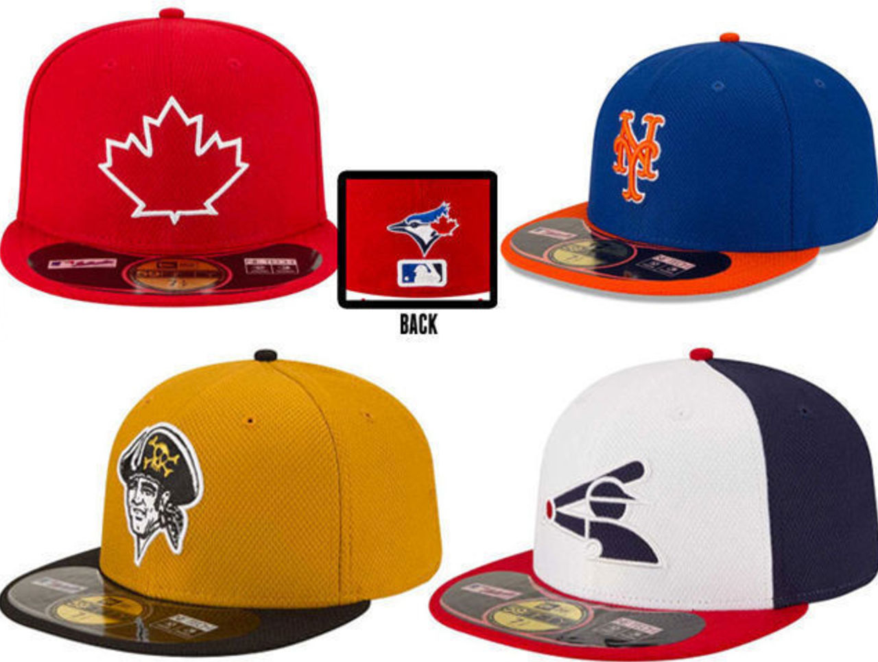
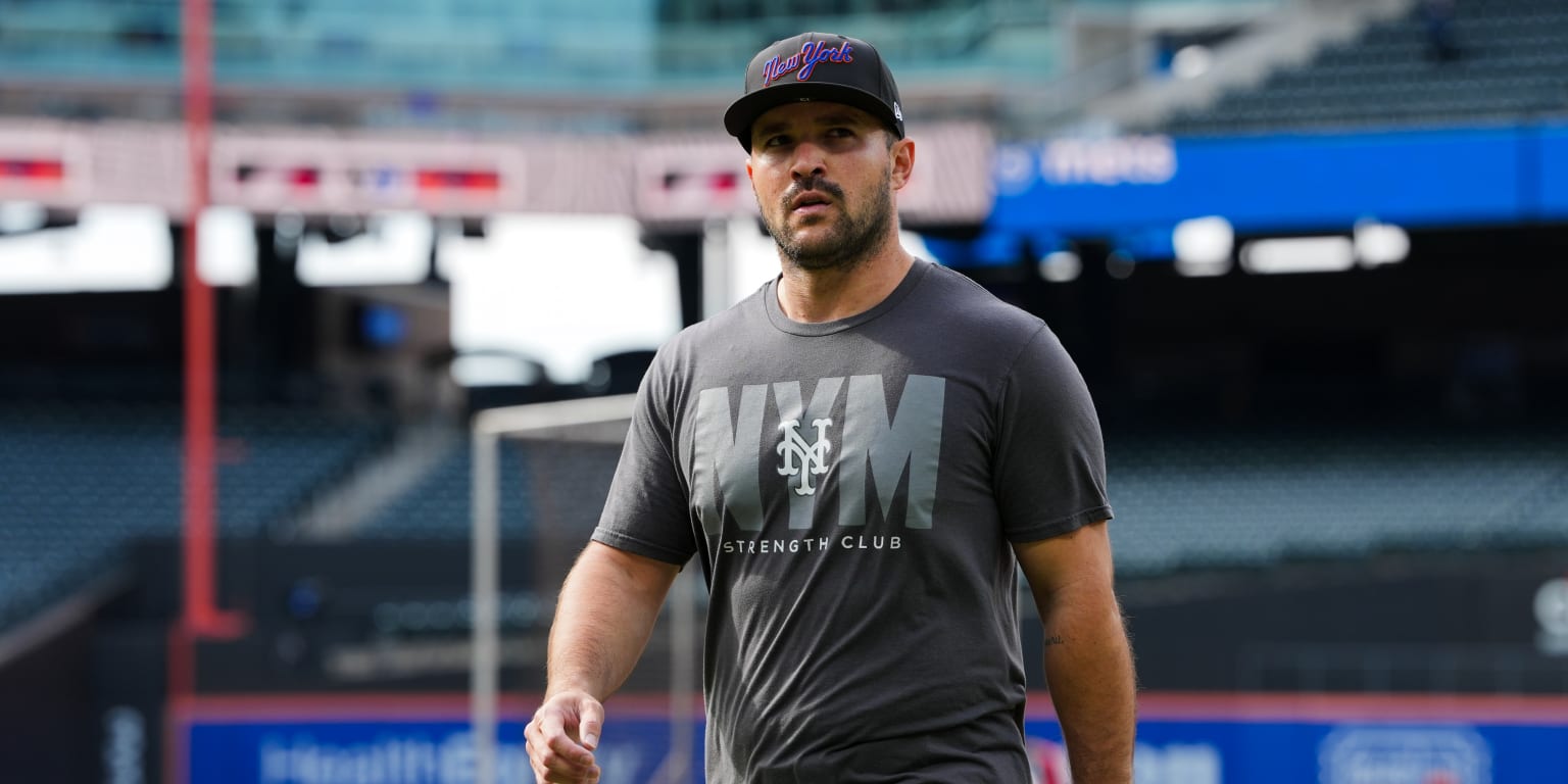
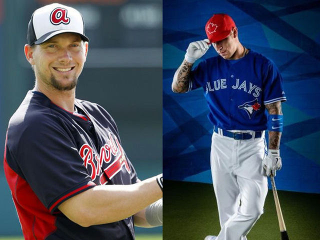
... like the Toronto Blue Jays, Chicago White Sox, and New York Mets. These "alternate BP caps" (do we really need an alternate cap for batting practice?) were introduced by NewEra, official on-field cap provider to MLB, out of the blue just a few days before spring games started. What's odd is it seems none of these caps will actually be worn during batting practice or during spring training instead they'll be used in the regular season during actual games.
The Blue Jays have announced theirs will be reserved for Canada Day with their special red Canada jerseys, Chicago is pairing their "fauxback" 1980s cap with a 1983 throwback uniform which will be worn several times in 2014. It's assumed Pittsburgh and the Mets will wear theirs in place of similar caps worn during the 2013 season, neither club has announced their plans yet.