Welcome back to your weekly update in the world of wardrobe. This week we saw teases of new uniforms in New York and Calgary, as well as the end of a jersey contest, a mismatched throwback, and some more pink.

Courtesy of a tweet we now know for sure that the New York Knicks will be adding a new orange alternate uniform to their set in the coming days. The Tweet showed a closeup of the familiar "NEW YORK" script arched in blue and white on an orange mesh jersey. This teaser graphic confirmed the leaked photo we saw over the summer which showed an all orange uniform worn during a photoshoot for adidas.
This won't be the first time the Knicks have ever worn an orange uniform, but it will be the first time they've done so regularly. The Knicks took to the court for a single game on Christmas Day 2012 in an orange uniform which included orange numbers and lettering, part of the NBA's ridiculous "BIG COLOR" promotion they ran last season.

Elsewhere in basketball, the Dallas Mavericks have moved on to the final phase in their search for a new look. Following Mavs owner Mark Cuban's personal blog post last season encouraging fans to design their new uniform set, the team had announced finalists and was accepting fan votes to help decide the winner.
The club is asking us to wait while they announce the winners but the vote totals are public - unless the club decides to override the results the winning entry is blue with "MAVS" arched across the front in white, the negative space in the "A" of "MAVS" in the shape of a star - kinda reminiscent of the old Dallas Stars logo. Rounding out the top three were designs heavily influenced by the Seattle SuperSonics and Denver Nuggets. So, to recap, the Stars beat out the Sonics and Nuggets in the new Mavs jersey contest.
Moving on to the NFL where fans were terrified when it was announced Nike was taking over the NFL uniform contract in 2012; visions of the Chicago Bears in black with sublimated grizzly fur and neon-orange numbers danced in our heads. Our fears were eventually alleviated; most teams kept their old look, only the Seattle Seahawks decided to play the Nike game at the time with Jacksonville joining in on the ugly parade a year later... well, you can add one more float to that parade.
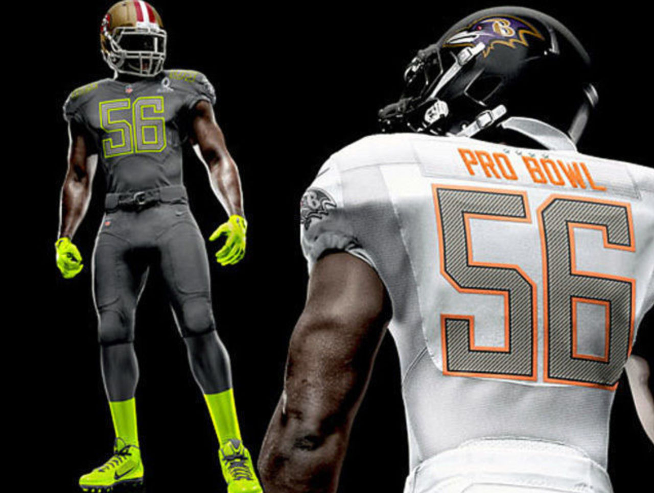
Those anti-traditional designers at Nike are at it again, the company unveiled the new uniforms of the 2014 NFL Pro Bowl earlier this month. This edition of the Pro Bowl is the first to not be AFC vs. NFC but instead a NHL All-Star Game style draft will take place between the two team captains. This change essentially left the designers to do whatever they wanted with the uniforms, there's no restrictions to keep the uniforms themed to the conference they represented because they don't represent anything.

What we have are Team Grey and Team White. The grey team with the all-over grey look - jerseys and pants, with neon green trim around the (also) grey numbers. Player names will be neon green, as will be the gloves, socks, shoes and a stripe which goes part-way down the side of the pants.
Team White is much more tame, as an all-white uniform typically is. Replacing neon green everywhere as the accent colour is neon orange. Both teams will wear their respective NFL team helmets with the bold uniforms (which will surely create an interesting clash of colours and styles) along with their team logo in a silver monochromic version of itself on the sleeve.
Now, if only anyone actually watched the Pro Bowl.

Last week, the Green Bay Packers went with their 1929 ACME Packers throwback uniforms, featuring a large yellow dot in the middle of a navy blue jersey. A stark departure from the classic green and gold we've come to associate with "the Cheeseheads".
The club had originally planned on wearing a helmet which featured a faux-leather patterned shell (like they wore in 2012), to simulate the leather helmets players originally wore at the time, but the NFL's new policy on only allowing one helmet per player per season put an end to that.
The Packers instead wore their regular 2013 helmets with their modern day logos and stripes stripped off, leaving a plain yellow shell with a terribly mismatched (with a blue and yellow jersey) green face mask.

We also saw the on-field début of the new Jacksonville Jaguars alternate teal jerseys and the return of the Tennessee Titans navy blues this past Sunday. The Jaguars new look provided a welcome break from the all-black/all-white look the club has been alternating between throughout the season. But no matter what colour of jersey the team wears it can never take away from the horribleness that is their new half-black, half-gold helmet.
I'm betting we don't see the Jaguars using this helmet design too much longer. Tennessee went navy blue for the first time since 2009 (it had been so long, we stopped listing it as a current jersey over on our site), the Titans were holding a "Go Blue" promotion where every fan was encouraged to wear blue or something. Whatever. The navy blues actually looked nice, I wouldn't mind seeing them out there in that more often.
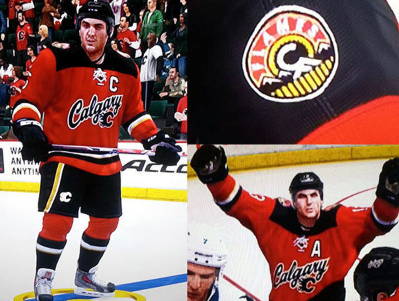
In the NHL, the Calgary Flames teased their fans with a video showing snippets of their new alternate uniform. The new jersey, set to be unveiled next Sunday, was leaked courtesy a premature, and quickly removed, NHL14 video game roster update late last month. The new look is red with black shoulders featuring "Calgary" written across the chest. There's also a new shoulder patch on the jersey which incorporates a mountain and wheat together to form the initials "CF". Snazzy.
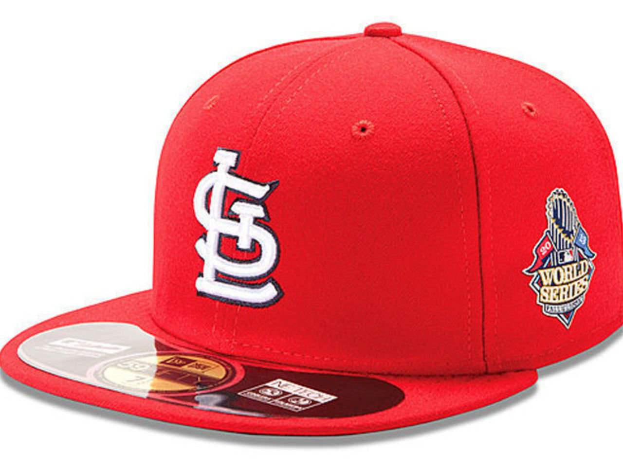
The World Series is set to get underway tomorrow, as has been the case in every Fall Classic dating back to 1996 both teams will be wearing cap patches in addition to jersey patches. We got our first look at the new 2013 World Series cap patches after the Cardinals clinched the NL pennant, you can see it in the photo above.
Speaking of clinching the pennant, did anyone else notice both the AL and NL logos were featured, quite prominently on BOTH the AL and NL champions caps? The NL logo should be nowhere near an AL Champs cap or a Boston Red Sox logo, same goes for the AL and the Cardinals. Was it really that hard to make one design with one logo for each league?

Finally, and it seems like we end with these guys fairly often, the Oregon Ducks joined the pink party by wearing a pink helmet for their game against Washington State this past weekend. The helmets, some of which were autographed by notable alumni, were then auctioned after the game with proceeds going to various breast cancer charities.
Chris Creamer is the creator and editor of SportsLogos.net. You can follow him on twitter at @sportslogosnet.