Oregon's 10 best uniform combinations
Oregon released a new uniform combination Thursday that pays homage to its mascot, The Duck.
The program is known for its wide variety of color combinations, and has gone with several different looks over the years. Opinions are widely mixed, with some combinations receiving glowing praise and others viewed as ghastly.
Here are our choices for the 10 best:
10. This all-forest green isn't too flashy, but its color stands out from most other schools around the country, Sometimes being understated is a good thing when it comes to uniforms.
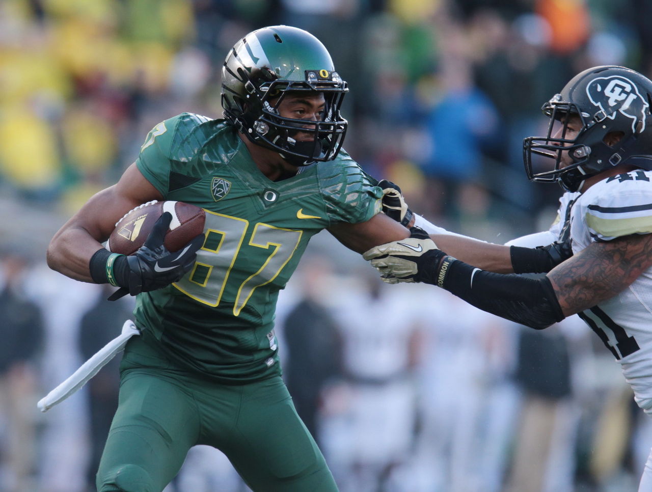
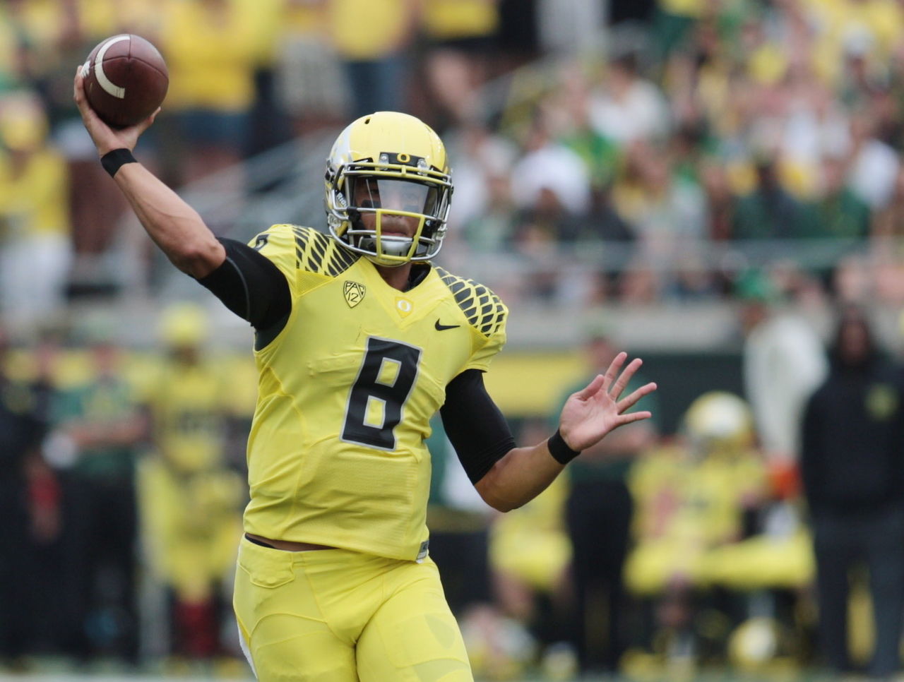
9. The yellow jersey, black helmet combo from earlier this year is similar to a color rush uniform the Pittsburgh Steelers might wear. Even though it lacks the traditional Oregon green, the combo really pops.
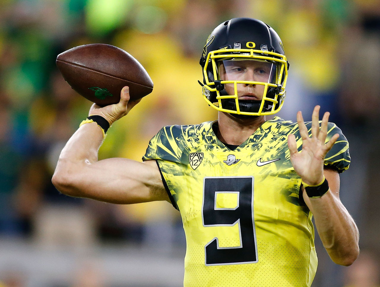
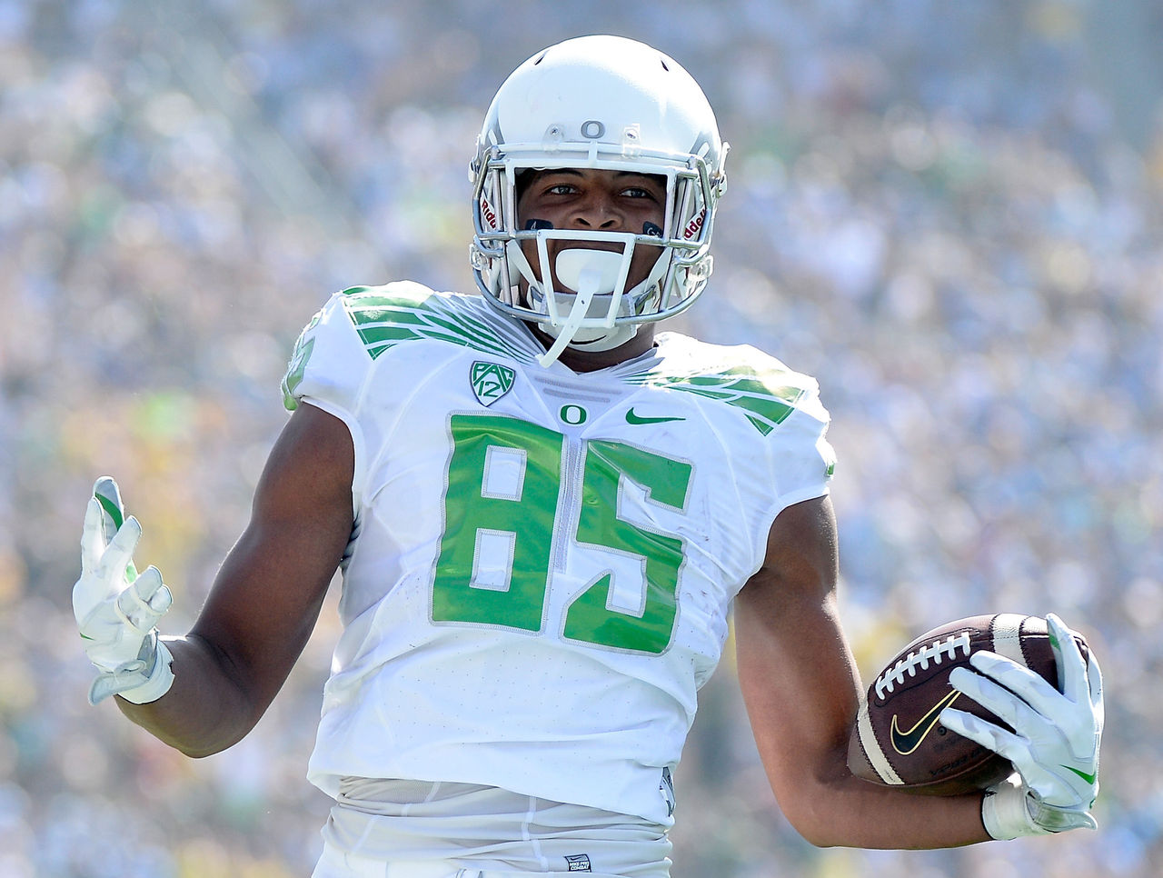
8. It's hard to pull off the all-white uniform, but that shade of green by the Ducks makes this solid.
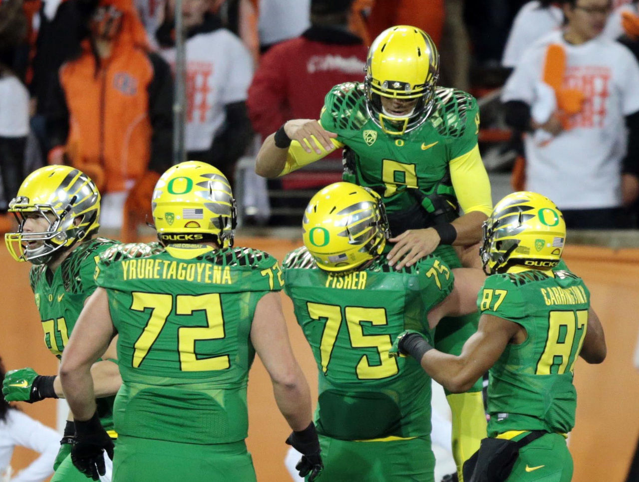
7. The yellow helmets and numbers complement the green, and the helmets and jerseys avoid looking too busy despite feathers covering much of each.
6. This all-yellow combo from 2013 is very similar to No. 9, just without a black helmet. Solid color combinations aren't easy to nail, but this rare version is a winner.
5. Lime-green pants with a white jersey and helmet are something the Ducks should wear more often. The helmets give it a modern look, while the shade of green keeps it old school. It's a solid combo.
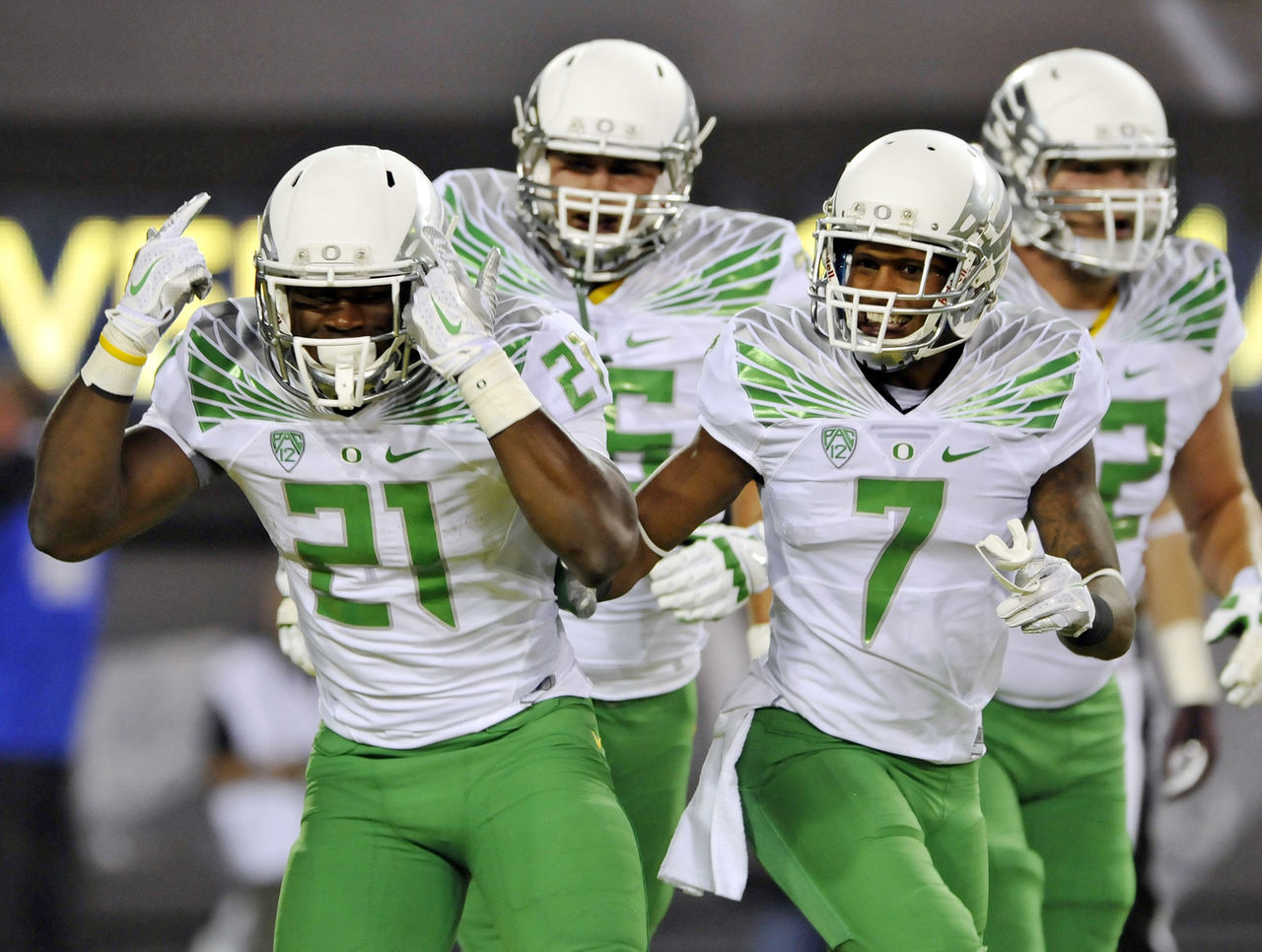
4. This is similar to an inverted No. 5, but the Duck logo on the helmet pushes it up the list. Going with The Duck's green face instead of the traditional "O" on the white helmet was a good call.
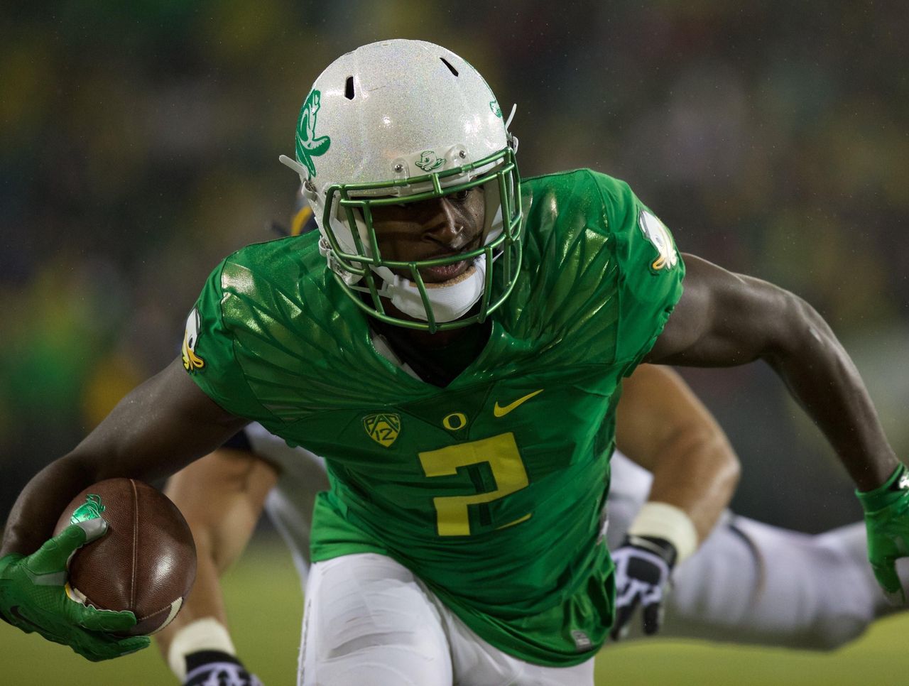
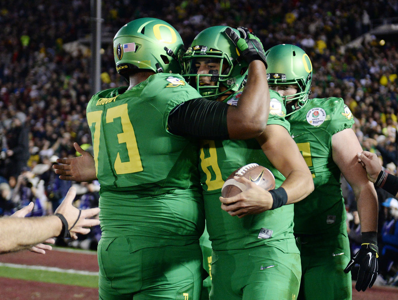
3. These classics from the 2015 Rose Bowl may be the best shade of green the Ducks have ever used. Opting for only that color makes it stand out even more.
2. These don't exactly scream Oregon and from a distance you may have a tough time distinguishing them. However, the sleek look really works and they will go down as one of the most unique in Ducks' history.
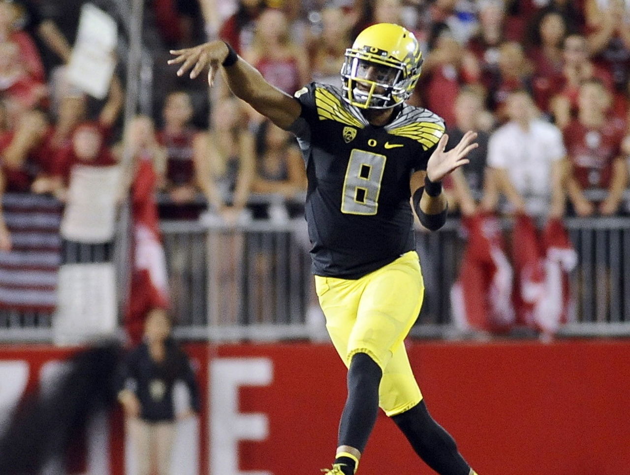
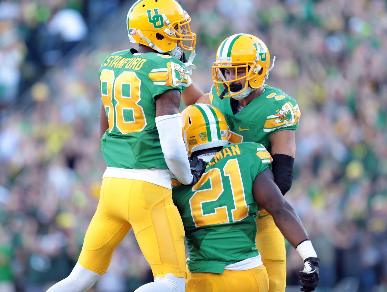
1. It's ironic that the most classic look from a program known for innovative designs was our choice for No. 1. These throwback unis go against the chrome and in-your-face style most schools go with these days, but they ultimately stand out as a unique blend of the past and present.
HEADLINES
- Report: Texans sign Will Anderson to 3-year, $150M extension
- Garret Anderson, the Angels' career hits leader, dies at 53
- Good, but not great. Are playoff-bound Raps stuck in no man's land?
- Report: LeBron retirement real possibility after playoffs
- Which Canadian team has best chance to end nation's Stanley Cup drought?