The Los Angeles Chargers unveiled their new logo Thursday and it wasn't exactly well received.
Maybe people are simply nostalgic for the Chargers' classic blue-and-yellow lightning bolt logo, but something about the new identifying mark sent Twitter users into a frenzy of mockery.
We've collected the best tweets below.
— Jimmy Donofrio (@JimmyDonofrio) January 12, 2017
— Nick Hardwick (@hardwina) January 12, 2017
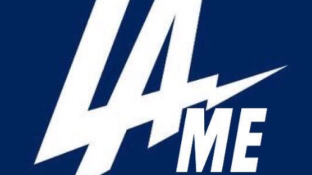
Hey @chargers I fixed your new logo you're welcome pic.twitter.com/iYheLDNKtb
— Torque Penderloin (@AndrewCieslak) January 12, 2017
— DraftKings (@DraftKings) January 12, 2017
The new Los Angeles Chargers logo 🔥⚡️ pic.twitter.com/NPHp2Gq7H2
— NFL Retweet (@NFLRT) January 12, 2017
my favorite feature of the new LA Chargers logo is how easily you can color it into a turtle pic.twitter.com/wlHRG8q4XM
— uɐɯssnS ʇʇɐW (@suss2hyphens) January 12, 2017
My favorite sports team is the Los Angeles Sideways Dragon Heads. pic.twitter.com/4iOCQTwYUx
— Grant Brisbee (@mccoveychron) January 12, 2017
Family tree pic.twitter.com/3PpxHE4pbb
— Jay Busbee (@jaybusbee) January 12, 2017
Guess it's better than the second place logo choice. pic.twitter.com/qVaecVC6rr
— Chris Burke (@ChrisBurke_SI) January 12, 2017
*checks mentions*
— Tampa Bay Lightning (@TBLightning) January 12, 2017
*squints*
*clears throat*
for the record, us & the @dodgers are just friends https://t.co/jBoJhZlYVD


