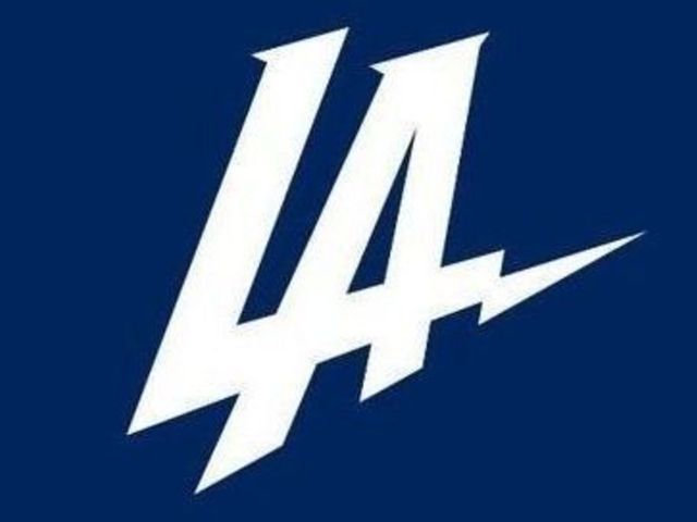
The Los Angeles Chargers' new promotional logo wasn't exactly a hit with fans when it was released in conjunction with the franchise's announcement of its move away from San Diego this week.
The logo - which first appeared to be based heavily on the Los Angeles Dodgers' logo - was quickly changed to the Chargers' usual powder blue and yellow color scheme, but even that didn't fix the issue.
Now, the Chargers have admitted their error, saying the logo won't be used in the future.
"The logo that was revealed on Thursday was meant to help launch our brand into the market and supplement - not replace - our official team marks," Chargers president of business operations A.G. Spanos said in a statement provided to Mike Florio of Pro Football Talk. "Clearly, we miscalculated how the logo would be received, and we’ve taken it out of the rotation.
"If we make a mistake, we own it, learn from it, and move on without looking back."
Spanos said the Chargers could attempt "another shot" at a logo that highlights their new home of L.A. "down the road."
"If the ultimate outcome of this episode is something really special that L.A. fans help create and truly love, that's a win," Spanos said.
The Chargers are not expected to undergo a substantial rebrand with their new relocation, at least not initially, as it takes several years for the NFL to approve such changes.


