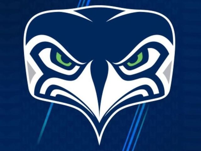
The Seattle Seahawks attempted to subtly unveil a new alternate logo Tuesday evening, switching the profile pictures on their social media accounts to a head-on look at their typical trademark.
Seahawks unveil alternate logo (H/T @sportslogosnet) pic.twitter.com/tRgGq0ZhqQ
— Darren Rovell (@darrenrovell) September 6, 2017
Of course, Twitter wasn't going to let the logo unveiling go unnoticed, and quickly pointed out the new look may not be as stylish or intimidating as the team may have hoped:
I… I just don’t know what to think about this new #Seahawks logo. pic.twitter.com/2jVVsPaIUk
— Stephen Cohen (@scohenPI) September 6, 2017
Seahawks new logo and mascot @sportspickle pic.twitter.com/CadQpAWAJ7
— Matt (@Datt_Mavis_) September 6, 2017
New Seahawks logo looking like a librarian who is disappointed in you because you turned your books in past their due date pic.twitter.com/OVrfw0YdgH
— Natalieeeee (@MsNatalieHughes) September 6, 2017
Is it just me or on a quick glimpse does the Seahawks new logo look like an outline of his face lol pic.twitter.com/1ogy5qukki
— Lil Yin (@mattkeef40) September 6, 2017
Does anyone else think the @Seahawks logo looks like a pug when you flip it upside down? #OrIsItJustMe #SmokeAnotherOneDan pic.twitter.com/nB3h7SKyw9
— A Man They Call Dan (@DanTheSportsFan) September 6, 2017
