theScore is ranking all 30 NHL jerseys. We're counting down by six each day this week.
30. Anaheim Ducks

We all long for the return of the Mighty Ducks.
Four primary colors is difficult to pull off, and although it's unique, the color scheme the Ducks employ is far too busy. A logo featuring more than a duck's foot would make sense too.
29. Carolina Hurricanes

Meh.
The colors certainly pop, but Carolina's get-ups lack any sort of punch. The checkered pattern of years past at least provided some intrigue.
28. Ottawa Senators
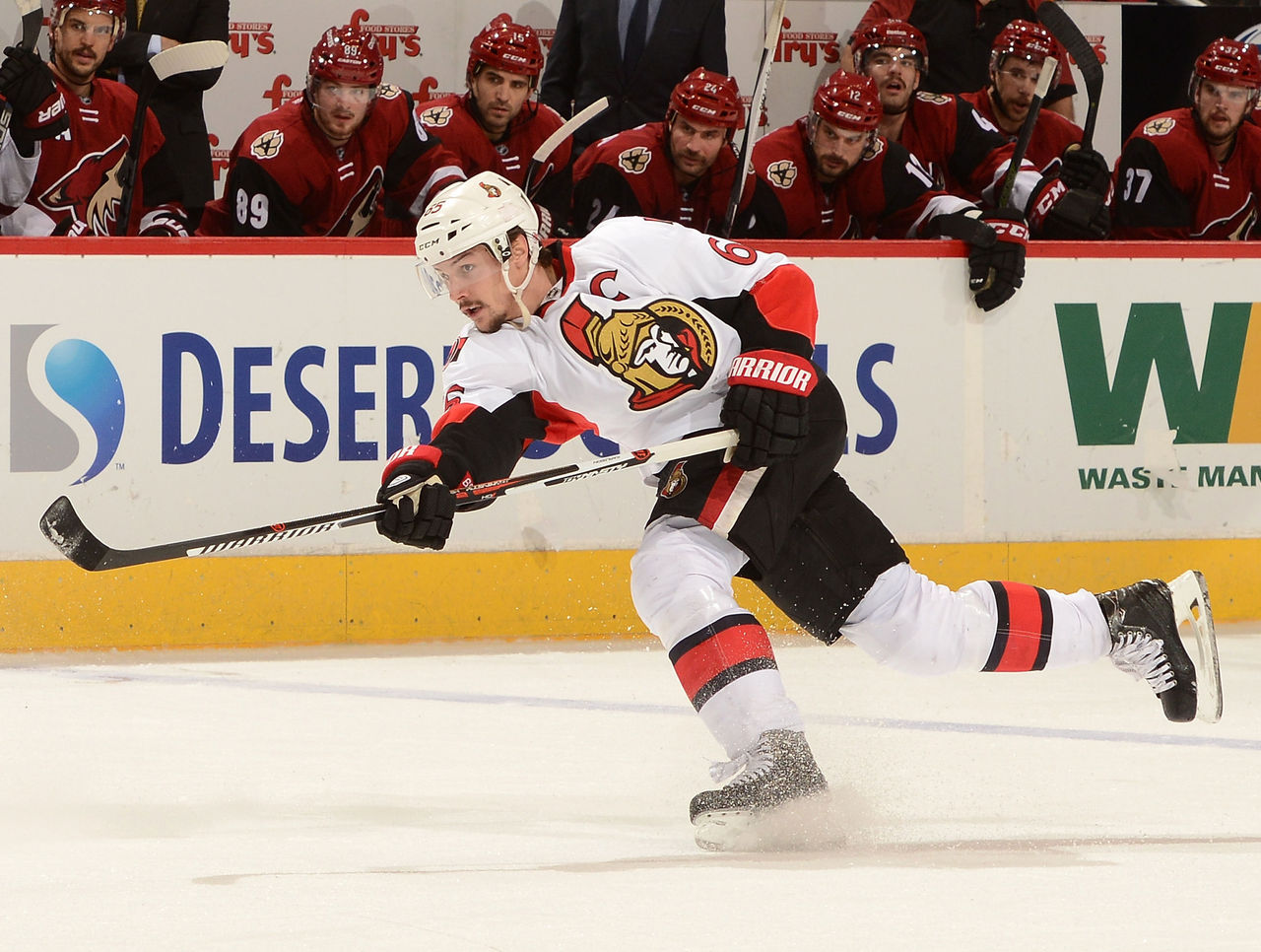
Ottawa's horizontal-striped alternates are glorious, but their regular duds could use some improvement.
The design on the jersey doesn't match the socks, and the stripes on the socks don't match the stripes on the pants. Call it nitpicking, but details are what make uniforms great.
27. Arizona Coyotes
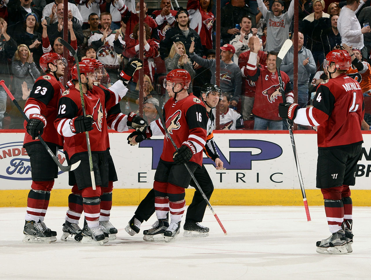
Adding black to a simplistic burgundy and white color scheme brought the Coyotes back a step. It's a shame, because Arizona's logo is one of the best in the league.
26. Calgary Flames

The Flames could use a re-brand.
The vertical piping on Calgary's jerseys is out of date, and the black logo certainly doesn't pop as much on a dark red background as the white one did in the past.
That said, the flaming letters used to represent Calgary's captains are outstanding.
25. Columbus Blue Jackets
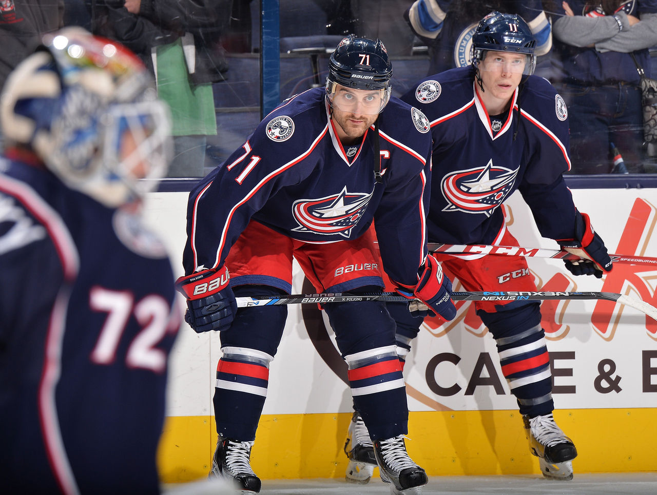
Red pants save a relatively bland uniform for the Blue Jackets.
The cannon shoulder patch would be much better served as a primary logo, but let's just be thankful there's no more neon-green bugs involved.


