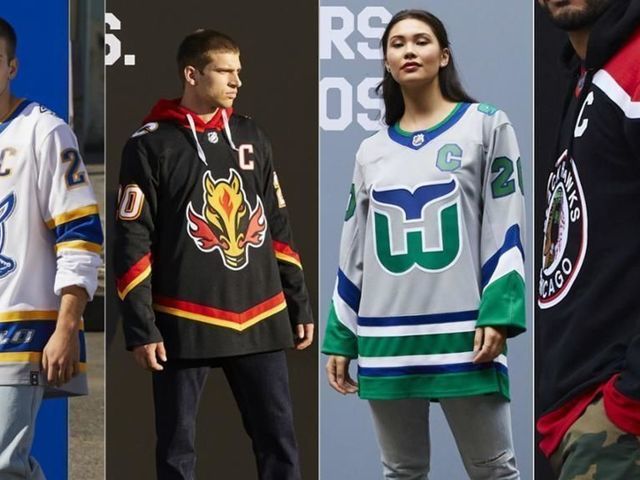
After teasing the hockey community for weeks, the NHL on Monday finally released its Reverse Retro jerseys for all 31 teams.
Some are fantastic, while others miss the mark completely. Below, we rank each new kit from worst to best:
31. Vegas Golden Knights
— NHL (@NHL) November 16, 2020
Given they've only existed for three seasons, the Golden Knights don't have much history to draw from. They decided to honor the now-defunct IHL's Las Vegas Thunder in a blend with their current colors, but it clashes terribly.
30. Detroit Red Wings
— NHL (@NHL) November 16, 2020
Eliminating red from the details in the Red Wings' uniforms should be considered a sin. These look like practice jerseys at best.
29. Winnipeg Jets
— NHL (@NHL) November 16, 2020
This one is a head-scratcher. The Jets have donned some of the nicest threads in league history, but the decision to drown out the blue with a grey base is a complete disaster.
28. Nashville Predators
— NHL (@NHL) November 16, 2020
At first glance, the return of the original sabertooth feels like the only retro thing about the Predators' remix. But the striping along the arms is also an homage to the earliest edition of the club's uniform, which hasn't varied much over its relatively brief history.
27. Dallas Stars
— NHL (@NHL) November 16, 2020
The Stars get points for bringing back their best logo, but the design is incredibly uninspiring and feels incomplete.
26. Toronto Maple Leafs
— NHL (@NHL) November 16, 2020
The Maple Leafs' 1970-inspired design was a promising idea, but incorporating grey into a scheme that's only ever used two colors makes no sense. The logo doesn't seem to match the rest of the outfit, either.
25. Columbus Blue Jackets
— NHL (@NHL) November 16, 2020
The Blue Jackets pay homage to their original emblem in this retro thread, but going with red as the primary color doesn't feel like the right choice for a club that's donned several strong shades of blue over its existence.
24. Vancouver Canucks
— NHL (@NHL) November 16, 2020
The Canucks have used so many unique color palettes throughout their history, and it feels like they could have done more with this opportunity. Perhaps the stick-and-puck logo in a flying-skate theme?
23. San Jose Sharks
— NHL (@NHL) November 16, 2020
The Sharks have rocked teal for their entire existence, and we wish the color was more involved in this underwhelming design.
22. Philadelphia Flyers
— NHL (@NHL) November 16, 2020
The Flyers have never had an alternative logo, and why would they? The classic winged "P" has been worked into a sharp look inspired by the mid-90s Flyers and the Legion of Doom line featuring Eric Lindros, John LeClair, and Mikael Renberg.
21. Anaheim Ducks
The moment you've been waiting for!
— NHL (@NHL) November 16, 2020
Check out these beautiful #ReverseRetro jerseys by @adidashockey ⬇️ pic.twitter.com/V9RBDOxM6C
In a traditional sense, the Ducks' design doesn't make for a look that will stand the test of time. But Anaheim embraced its roots and went all-out, which we have to respect.
20. Buffalo Sabres
— NHL (@NHL) November 16, 2020
If the "Goat Head" shoulder patch was the central logo of this beautifully colored jersey, the Sabres' new look would be among the best of the bunch.
19. Tampa Bay Lightning
— NHL (@NHL) November 16, 2020
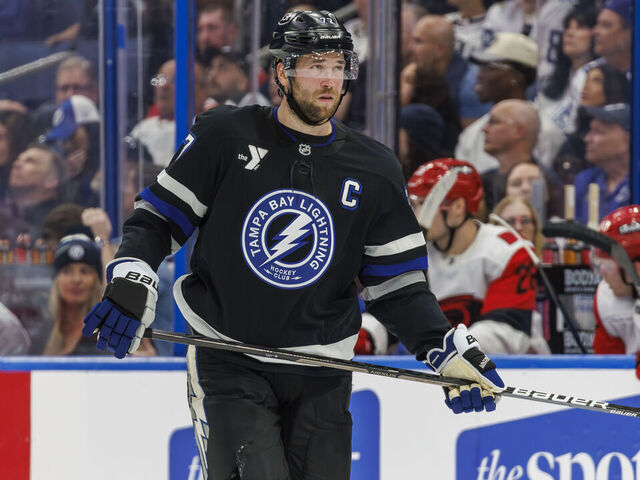
Tampa's old logo is better than its current one, and the defending Stanley Cup champions' clean design certainly passes the test for this exercise. That said, there's nothing particularly special about the Lightning's latest jersey.
18. New York Islanders
— NHL (@NHL) November 16, 2020
The Islanders don't have a ton to work with in terms of retro looks without bringing back the polarizing "Highliner" logo. Still, this uniform is sharp. The design pays homage to the dynasty of the early 1980s, while the navy blue is a tribute to the team's one-time primary color.
17. Ottawa Senators
— NHL (@NHL) November 16, 2020
This looks more like an alternate for the Senators' new full-time look than a textbook Reverse Retro, but it does look good. The red is a solid complement to Ottawa's regular home and away sets.
16. Pittsburgh Penguins
— NHL (@NHL) November 16, 2020
A wordmark logo is typically a cop-out, but the Penguins' diagonal print immediately takes us back to the magical days of Mario Lemieux and Jaromir Jagr, which has to tickle hockey fans everywhere.
15. Chicago Blackhawks
The Blackhawks adidas #ReverseRetro jersey is now available for pre-order! pic.twitter.com/mtRetNvk1b
— Blackhawks Store (@BlackhawksStore) November 16, 2020
The Blackhawks throw it back to the 1940s and '50s with this retro fix. It's simple yet very sharp, and reversing the red-and-black color scheme is a neat idea.
14. Washington Capitals
— NHL (@NHL) November 16, 2020
The opportunity to bring back the Capitals' screaming eagle was a can't-miss, and the decision to go with red as the primary color actually works quite well. The slanted wordmark at the bottom is also a nice touch to this patriotic outfit.
13. St. Louis Blues
— NHL (@NHL) November 16, 2020
Bringing back the red uniform is a daring but excellent move for the Blues' retro set. This classic was worn by some of the greatest players to ever suit up for the franchise, including Wayne Gretzky, Brett Hull, and Chris Pronger.
12. Arizona Coyotes
— NHL (@NHL) November 16, 2020
The NHL needs more bold color choices, and Arizona's purple kit fits the bill. The Kachina head truly shines in front of a vibrant background, and the desert details along the bottom artfully pay homage to the Coyotes' history and home state.
11. Florida Panthers
— NHL (@NHL) November 16, 2020
Florida's leaping panther is miles ahead of the logo the team wears today, and the navy blue is a perfect backdrop for the rest of the club's beaming colors. This should stick around as the Panthers' full-time alternate.
10. Calgary Flames
— NHL (@NHL) November 16, 2020
"Blasty" has made a triumphant return. With the Flames reinstating their 1980s look on a full-time basis earlier this offseason, the fiery horse head was the correct choice for their throwback.
9. New York Rangers
— NHL (@NHL) November 16, 2020
It's hard to go wrong sporting one of the world's most iconic landmarks. Lady Liberty is an absolute classic, and the Rangers made the wise decision bringing her back in this classy retro look.
8. Los Angeles Kings
— NHL (@NHL) November 16, 2020
The best Kings logo combined with the best Kings colors; what a concept. It's a mystery why Los Angeles ever ditched the purple and gold.
7. New Jersey Devils
— NHL (@NHL) November 16, 2020
The Devils' remix takes us back to the franchise's birth in 1982. Introducing green as the primary color is a bold tribute to the club's original look, and it works extremely well in this unique and nostalgic uniform.
6. Boston Bruins
— NHL (@NHL) November 16, 2020
After primarily using black for their alternate designs in recent years, the Bruins opted for a shift to yellow, and we dig it. The simplified spoked "B" and vintage bear-head shoulder patch are excellent touches as well.
5. Montreal Canadiens
— NHL (@NHL) November 16, 2020
Many would consider it blasphemous for the Canadiens to ever stray for their basic home and away kits, but you'd be crazy to deny this look turned out perfectly.
4. Edmonton Oilers
— NHL (@NHL) November 16, 2020
This design practically sparkles. The Oilers shifted to a darker scheme at the dawn of the Adidas era, and it's difficult to understand why. The orange shoulders bring a slightly unusual look, but combining them with blue detailing and an untouchable logo makes for one gorgeous sweater.
3. Minnesota Wild
— NHL (@NHL) November 16, 2020
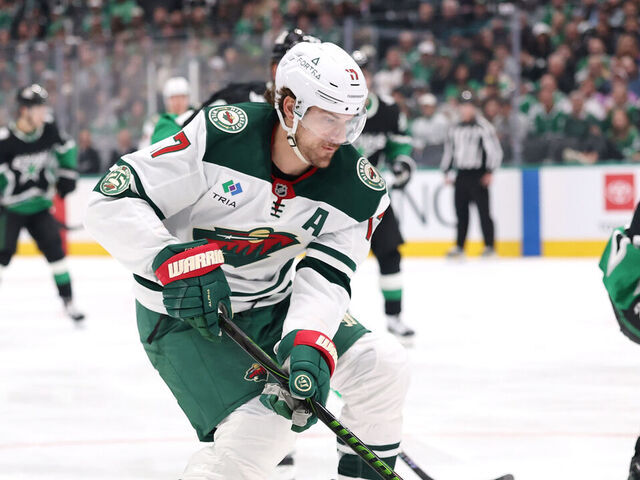
This blend of old and new is simply wonderful. The unique mix of green, yellow, and white is synonymous with the Minnesota North Stars, and the Wild's current logo is one of the best in sports. It's a pretty strong recipe for an all-time look.
2. Carolina Hurricanes
— NHL (@NHL) November 16, 2020
The Hurricanes have recently honored the Whalers' classic look, but they've never dawned this slick version of the outfit. The grey base instead of the green is a new twist, but the former color is the only one shared by both iterations of the franchise.
1. Colorado Avalanche
— NHL (@NHL) November 16, 2020
Colorado's remix is simply flawless. The logo is a nod to the franchise's roots in Quebec, as are the fleurs-de-lis along the bottom of the jersey. The powder blue and Avalanche maroon make for a perfect color scheme that beautifully ties together the club's past and present.
