The first batch of the NFL's new Rivalries uniforms is here.
AFC East and NFC West teams announced the league's new series of alternate looks Thursday.
The idea is similar to the City Edition and City Connect uniforms in the NBA and MLB, respectively. Each NFL team is required to wear the new jerseys for one home contest against a divisional rival each season over a three-year stretch. The AFC South and NFC North (2026), the AFC West and NFC East ('27), and the AFC North and NFC South ('28) will join the program in the following years.
Here's how this year's Rivalries uniforms stack up.
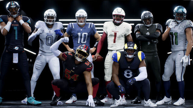
8. Seattle Seahawks
The Seahawks could've made better use of what they have to work with.
The combination of grey and iridescent green on the jerseys doesn't stand out as much as fans might have hoped given Seattle's traditional color scheme and previous uniform designs. The chrome finish on the helmet also doesn't do much for us.
Perhaps the best thing about the Seahawks' new look is its connection with the fan base. But the No. 12 pattern in the jersey numbers is a bit much.
7. New England Patriots
Are we the only ones who think the Patriots' Rivalries look is missing something?
Maybe it's the "Nor'easter" vibes with the storm blue as the base. Maybe it's the basic "NE" shoulder logo. Or maybe it's all the elements in combination.
The jersey numbers feature vertical striping and a nod to the Pats' 1990s uniforms.
6. Arizona Cardinals
The Cardinals' alternate jerseys are fine, but the matching jersey and pants - both featuring a "sandblast" print on a light sand color - don't look great together at first.
Arizona's new look tries to mirror the harshness of the desert heat. The new helmet also features a sandblasted look with a 3D logo.
5. New York Jets
The Jets' new look is decent, but it doesn't do anything to justify being ranked higher on this list.
The "Gotham City Football" concept is certainly a hit. It adds a darker look to the team's green colors. However, the updated circle logo and jersey number fonts are misses.
4. Buffalo Bills
Winter is coming, and the Bills are ready for it.
Buffalo loses a few points for not thinking outside the box when it comes to its alternate color scheme. Other NFL teams have opted for all-white uniforms in the past.
At least the Bills' icy white stands out for its connection to the city of Buffalo and the team. The best thing about these uniforms might be the textured metallic charging buffalo with a royal blue outline on the sleeves.
3. Los Angeles Rams
The Rams are going Midnight Mode. The club's alternate look includes a near-black midnight base with a touch of blue, which looks great and connects the team to the city of Los Angeles.
The Rams deserve credit for the attention to detail here: The sleeves feature a full horn-curl design, a nod to the club's original jerseys.
2. Miami Dolphins
The Dolphins didn't go full Miami Vice, but they definitely explored the possibilities of their color scheme. The new number detail and jersey collar look great.
1. San Francisco 49ers
Yes, we've seen blackout uniforms in the NFL before. But the 49ers' alternate black jerseys with bold red numbers outlined in gold, inspired by the team's historic wordmark, are beautiful.
San Francisco - which already boasts one of the NFL's best traditional unis - also put a special touch on its new alternate helmets, adding a black shell with red stripes and a gold-coated facemask.


